21st Century Consort — Website, Performance Archive, and Streaming Library

21st Century Consort website folio showing homepage, searchable performance archive spanning 44 seasons and 774 performances, concert listings, recordings catalog, and custom streaming audio player designed and developed by Keith Bloom in ExpressionEngine

The 21st Century Consort was founded in 1975 as the 20th Century Consort — the resident ensemble for contemporary music at the Smithsonian Institution. For over four decades, the group has performed world premieres and balanced concert programming at St. Mark’s Episcopal Church on Capitol Hill, the Hirshhorn Museum and Sculpture Garden, and the Smithsonian American Art Museum, under the artistic direction of Christopher Kendall. By any measure it is one of Washington’s most significant serious music institutions — and one whose digital presence needed to match the depth and rigor of its archive.

This was a full technical and creative engagement, carried out as an independent project alongside my tenure at Cisco Systems. I designed and built the site in ExpressionEngine — beginning with version 2.5 and maintaining it through versions 5 and 6 over the course of the relationship — developing the content architecture, layout system, and CMS structure that would accommodate both the organization’s ongoing season programming and its deepening historical archive.

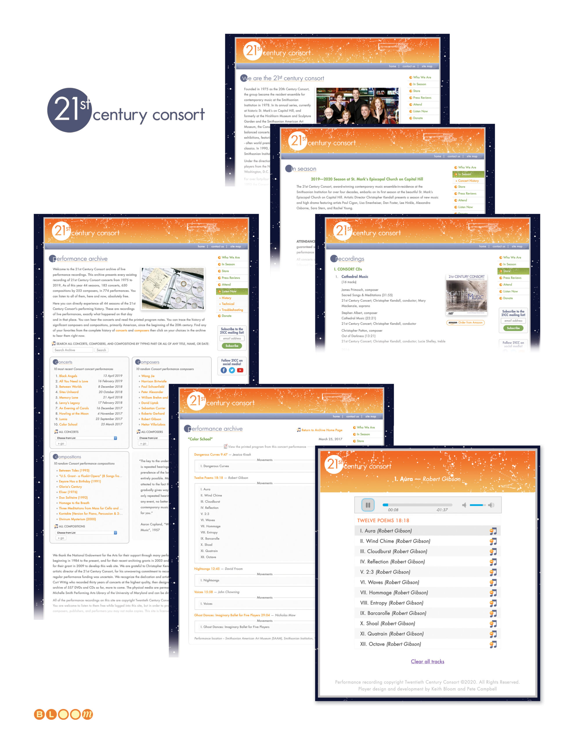
The performance archive is the heart of the site and its most technically ambitious component: a fully searchable database spanning 44 seasons, 183 concerts, 630 compositions by 253 composers, documented across 774 individual performances — all retrievable by title, name, or date, with individual program notes, composer profiles, and concert records fully cross-referenced. Building and maintaining that architecture — and populating it as decades of analog recordings were digitized from archive tapes and other legacy media and added in batches — was as much a library science project as a web development engagement. The physical recordings themselves — 557 DVDs and CDs archived by recording engineer Curt Wittig — are permanently preserved at the Michelle Smith Performing Arts Library at the University of Maryland, with the digital archive serving as the public access layer for that collection. The National Endowment for the Arts supported the archive’s development through performance grants beginning in 1984, with a specific grant in 2009 to fund the website itself.

The streaming audio player was co-developed with Pete Campbell, who contributed the initial jQuery and JavaScript assets before I assumed full ownership of scripting updates and revisions. The player went through multiple iterations tracking the evolution of streaming infrastructure — from Darwin Streaming Server through at least two successive IceCast Streaming Media service versions — each requiring the media library and player architecture to be adapted accordingly.

The client behind this project was, in his own way, a perfect collaborator — a deeply technical database enthusiast who shared the same appetite for chasing elegant solutions that’s always driven my best work. Many of the annual media library import sessions happened in cafes and shared workspaces around Washington, two people who genuinely enjoyed the problem as much as the solution. That kind of working relationship is rare, and it produced something that held together through nearly two decades of technological change.

In 2021, the client transitioned leadership of the digital relationship to a new board member who standardized the main site around a WordPress platform. The streaming library architecture wasn’t compatible with the new infrastructure, and the long collaboration concluded. What remains is a record of what was built — and something more than a record. The performance archive, still running on the IceCast streaming infrastructure as originally designed and built, continues to serve the complete catalog of 44 seasons, 630 compositions, and 774 performances to listeners worldwide, long after the main site moved to a new platform. The architecture quietly outlasted the transition.

Website Design, CMS Development, ExpressionEngine, Performance Archive Database Architecture, Streaming Audio Player Design and Development, IceCast Streaming Media Integration, Media Library Architecture, Content Management, Annual Media Library Updates

www.21stcenturyconsort.org

Yafo Networks — Identity, Website, and Print Design

Yafo Networks creative folio showing brand identity, cobalt and aqua wordmark with orbital ring logo, Netscape frames-based website design, PMD print advertising, Wake Up trade show campaign, direct mail, and seasonal greeting card designed by The Bloom Agency

The name was, by the founders’ own admission, a joke — YAFO: Yet Another Fiber Optic networking solutions company. It was the kind of self-aware humor that signals a technically confident team comfortable enough with the crowded optical networking landscape of the early 2000s to acknowledge it directly, because they knew they had something nobody else had cracked.

What they had was a solution to polarization mode dispersion — PMD — the signal degradation phenomenon that was blocking telecommunications carriers from upgrading their existing fiber infrastructure to 40 Gbps speeds. The alternative to solving PMD was replacing the fiber. YAFO’s hardware and software compensation technology meant carriers could maximize the utility of their current assets instead. Founded in June 1999 by Henry Yaffe in Hanover, Maryland, the company raised $61 million in venture capital across three rounds before its acquisition by Ciena Corporation — a validation of both the technology and the market timing.

The Bloom Agency was engaged for the full creative scope of YAFO’s marketing communications: identity design, website design, print advertising, trade show campaign, direct mail, and corporate collateral — all of it built in the compressed, capital-intensive atmosphere of the early 2000s optical networking market.

The Yafo logo is my design — a lowercase wordmark in a deep cobalt and aqua palette, with an orbital ring element arcing over the o. The ring is a deliberate double reference: to the optical lenses at the heart of the technology, and to the high-speed networking rings the product was designed to liberate. Light moving through glass at extraordinary speed, made visible in a single typographic gesture.

The website was designed in frames-based architecture for Netscape — the production reality of early 2000s web development — with a full site structure covering corporate strategy, management team, product information, a PMD Resource educational center, press coverage, and investor relations. Getting technical depth and marketing clarity to coexist in that environment required both design discipline and genuine understanding of what the product actually did and why it mattered.

The trade show campaign for SuperComm 2001 — Booth 8316 — was anchored by the “It’s Time to Wake Up!” concept, built around the insight that the industry was sleeping on the PMD problem at 40 Gbps while YAFO had already solved it. The campaign extended across print advertising, trade show materials, and a direct mail invitation that arrived sealed with a coffee-flavored scratch and sniff sticker. The concept and the execution were in complete alignment: every recipient who scratched that seal understood the campaign before they read a word. The greyhound billboard composite — an early Photoshop background replacement technique used as a campaign visualization — rounded out the competitive speed messaging.

The seasonal greeting card completed the relationship collateral — a snowman assembled from the Yafo orbital ring elements, wishing clients and partners happiness and success in the New Year with the same quiet wit that named the company in the first place.

Brand Identity, Logo Design, Orbital Ring Illustration, Website Design, Frames Architecture, Print Advertising, Trade Show Campaign, Direct Mail, Scratch and Sniff Production, Corporate Collateral, Seasonal Greeting Card, Production Management

Screen47.com — “We’re Rolling”

screen47.com campaign folio showing logo, Netscape 2.0 website UI designs, print advertising, direct mail, and Flash interactive elements created by The Bloom Agency — featuring the We're Rolling campaign line and Ebert and Roeper partnership

Before YouTube. Before broadband made streaming viable for the average household. Before anyone had coined the term user-generated content. There was screen47.com — a concept so ahead of its moment that the infrastructure to support it simply did not yet exist at the scale required.

The Bloom Agency was engaged to create the complete brand identity, website design, and marketing campaign for screen47.com — a global venue for independent filmmakers to submit, stream, and distribute their work to audiences worldwide, free of charge. The platform’s value proposition was elegant and genuinely radical for its time: you submit your film, we handle the distribution, the digitizing, the streaming, the audience building. Your film. Coming soon to screens everywhere.

The name encoded a quiet piece of conceptual depth — 47 is the atomic number of silver, a reference to the silver screen, tying a digital-native platform back to the physical poetry of cinema with a single numeral. The logo’s orbital ring system around that numeral suggested both planetary motion and content in perpetual circulation — a mark designed for a medium that hadn’t fully arrived yet.

The agency created the “We’re Rolling” campaign line — a phrase that does three things simultaneously: signals that the cameras are running, that the platform is live, and that the business has momentum. It ran across print advertising, direct mail, and the website UI itself, anchoring a visual system built in Netscape 2.0 that anticipated the streaming era with remarkable clarity.

The campaign attracted genuine institutional credibility. Film critics Roger Ebert and Richard Roeper were not merely conceptual supporters — they provided filmed endorsements specifically to support the client’s venture capital fundraising effort. That level of editorial endorsement for a platform concept that hadn’t yet reached scale speaks to how compelling the idea was to people who understood the future of film distribution.

A working demo of the site was built and demonstrated. The obstacle was not the concept, not the design, not the endorsements, and not the market appetite. It was bandwidth economics — access costs and service capacity made viable streaming prohibitively expensive at the scale required for the platform to gain real traction. The client ran out of runway before the infrastructure caught up. A competitor with a longer war chest and better timing eventually built the same idea and called it YouTube.

The work remains one of the most forward-looking engagements in The Bloom Agency’s history — and a reminder that being right about the future is not always enough.

Brand Identity, Logo Design, Campaign Concept, Tagline Development, Website Design, Print Advertising, Direct Mail, Interactive Design, Flash Production