Chronology Productions — Identity System

Chronology Productions identity system by Keith Bloom showing custom Orloj astronomical clock illustration in two colorways, CHRONOLOGY wordmark in navy and gold, and business card designs for Eric Heisserer's Hollywood production company

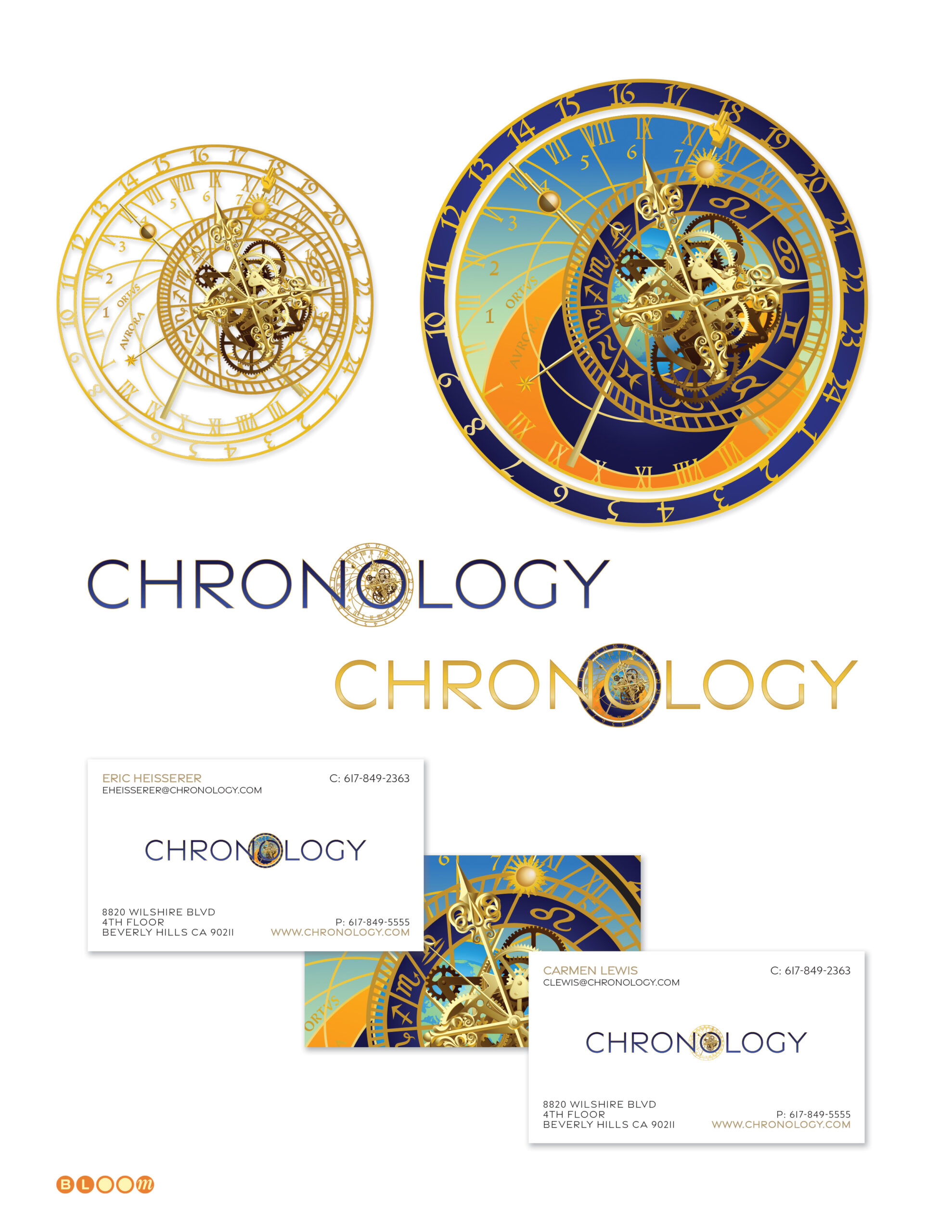
Some identity briefs arrive with the concept already latent in the name. Chronology Productions — a Hollywood production company founded by Academy Award-nominated screenwriter Eric Heisserer — needed a mark that could carry the weight of cinematic ambition, live gracefully in a credit reel, and communicate something about the relationship between storytelling and time. The answer was waiting in Prague.

The Orloj — the medieval astronomical clock installed in Prague’s Old Town Square in 1410 — is one of the most visually complex and historically resonant mechanical objects in existence. Its layered faces track solar and lunar time, the positions of celestial bodies, and the liturgical calendar simultaneously, all through an intricate system of gears, dials, and hands that has been turning for over six centuries. For a production company whose name is literally about time, no contemporary mark could compete with that lineage.

I illustrated the Orloj face from photographic reference — drawing the astronomical dial, the zodiac ring, the calendar face, and the surrounding architectural detail by hand to achieve the level of precision the concept required. The clockworks at the center are a composite of two stock illustration elements, layered and modified to create depth, visual richness, and — critically — animation readiness. Every layer was built to move. The clock was designed to turn.

The resulting mark embeds this fully realized Orloj illustration as the O at the center of the CHRONOLOGY wordmark — presented in two colorways: a refined gold line art version for single-color applications, and a full-color version in the deep navy, warm amber, and gold palette of the actual Prague clock for rich media and full-color contexts. The business card system carries the identity through to print with characteristic confidence — the clock face bleeding full across the card back as a detail image, the wordmark anchoring the front with clean spaced-cap authority.

The PowerPoint deck template completed the system. The engagement was carried out as an independent project alongside my role as a learning systems engineer at Cisco Systems — one of several creative commissions I maintained during that chapter to keep the practice fluid and the instincts sharp.

A footnote worth keeping: the identity work earned a valid IMDb membership for yours truly — a graphic designer’s entry into the same database that tracks every film the mark was built to precede.

Custom Illustration, Identity Design, Wordmark Design, Business Card System, Presentation Template Design

CubeSmart — National Brand Identity and Graphic Standards

CubeSmart didn’t begin as CubeSmart. It began as U•Store•It — an established national self-storage chain with hundreds of facilities across the country. The decision to rebrand, and the new name itself, came from the client. What they needed was someone to make that name into a mark — and the mark into a complete, living brand system that could govern every touchpoint of a national retail operation.

That’s where I came in. Commissioned as an independent project during my tenure at Cisco Systems, this was one of those engagements that demanded the full range of what I do best: custom type design, proportional precision, and the discipline to build a visual identity system rigorous enough to survive intact across thousands of facilities, dozens of advertising formats, and years of operational use.

I designed the CubeSmart wordmark from scratch — custom-drawn letterforms with proprietary glyph modifications that give the mark its distinctive character and ensure it reads as a composed, unified whole. The cubic icon that accompanies the wordmark is deceptively simple: a three-dimensional form that communicates storage, structure, and spatial intelligence in a single gesture, drawn with the same precision and optical refinement as the letterforms it sits beside. The mark was built in both outlined and solid variants, with stroke weights specified to fractions of the cap height to ensure consistent reproduction across every application at every scale.

The engagement extended well beyond the mark into a comprehensive graphic standards manual — the document that transforms a logo into a living brand system. The manual specified everything: wordmark construction and minimum margin rules derived from the proportional relationships within the mark itself; a typographic system anchored by Gotham Condensed Bold for headline use, with precise leading, letterspacing, and kerning values specified for Adobe Illustrator production; disclaimer and legal type specifications; phone number formatting rules; color palette across print and digital applications; and layout proportion grids governing how brand elements relate to each other across every format.

That system was then applied across the full spectrum of CubeSmart’s physical and digital presence — outdoor and large-format advertising, banner and point-of-sale materials in multiple colorway variations, website UI design, and the launch campaign that announced the transformation to the world: “U-Store-It… Reinvented!” — a line that acknowledged the legacy directly while declaring the ambition of what was coming.

The standards also covered architectural signage, building facade treatments, interactive advertising templates, and employee uniforms — the full environmental and operational spectrum of a national retail brand. Every touchpoint, every format, every application governed by the same proportional logic and typographic discipline that begins in the wordmark itself.

CubeSmart remains in active national use today, visible on facilities across the country. That kind of longevity is the most honest measure of whether a brand identity was built to last.

Creative Direction; Logo Design; Typography Design; Graphic Standards; Indoor/Outdoor Signage; Operations Graphics

Blueprint Magazine

Blueprint Magazine folio showing multiple quarterly issue covers and interior spreads designed by The Bloom Agency for the Democratic Leadership Council, including the Education and Quality of Life issues

Blueprint was the flagship publication of the Democratic Leadership Council — the centrist policy organization that defined the New Democrat movement and provided much of the intellectual infrastructure of the Clinton presidency. Subtitled Ideas for a New Century and published under the DLC’s The New Democrat banner, it was a serious policy journal with an editorial roster that read like a roll call of the era’s most consequential centrist voices: senators, congressmen, governors, mayors, and cabinet secretaries contributing to a national conversation about a third way forward for American politics and economic life.

The Bloom Agency was contracted to launch Blueprint from the ground up and manage its full creative production for two years. As founder and creative director, I designed the Blueprint masthead and typographic identity — a confident condensed sans-serif wordmark in cobalt blue that established the magazine’s visual authority from its first issue. I assembled and led the agency team responsible for layout and production, defining the typographic system, cover design language, and interior grid that gave Blueprint its consistent editorial voice across eight quarterly issues. Each cover was designed to carry real visual impact — the Education issue’s bold “adults vs. kids?” challenge, the Quality of Life issue’s full-bleed display type against urban imagery — while the masthead remained a steady, recognizable anchor throughout.

Over the two-year engagement, we systematized every aspect of the production workflow to the point where it could be transitioned seamlessly to an in-house team at the DLC — which it was, as a cost-saving measure after the contract concluded. Launching a publication, running it at a high creative standard for two years, and handing off a fully documented, production-ready operation is a different kind of creative responsibility than a single design engagement. Blueprint was all three.

Masthead Design, Visual Identity, Creative Direction, Typography Design, Team Assembly and Management, Print Production Management — 8 Quarterly Issues