GATF/PIA — D4D: Variable Data Digital Printing Campaign

GATF PIA D4D Designing for Digital campaign folio showing three variable data poster concepts — Age of Variable Data Digital Printing bicycle poster, It's Not Just Business It's Personal motorcycle poster, and Make Each of Your Customers Feel Like a Star Hollywood Walk of Fame poster — creative direction and variable data template engineering by Keith Bloom at The Bloom Agency

In September 2001, HP announced its acquisition of Indigo N.V. for approximately $882 million — absorbing the Israeli company that had pioneered digital printing technology and bringing variable data digital printing into the mainstream of the global printing industry. Print Expo 2001 was held at precisely this inflection point, and the Graphic Arts Technical Foundation and Printing Industries of America chose it as the moment to demonstrate to the industry exactly what this technology could do in the hands of a skilled creative team.

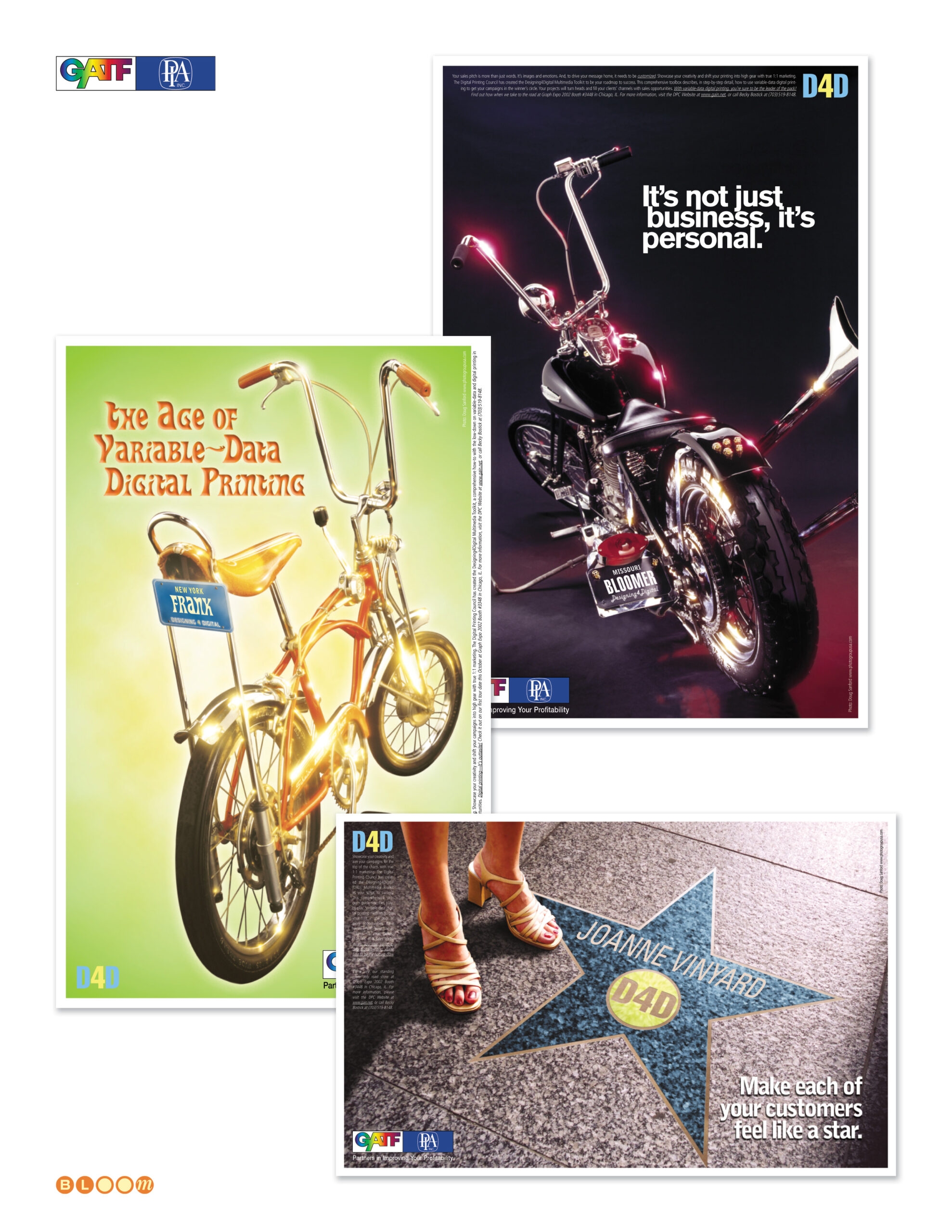
The Bloom Agency was engaged to create that demonstration. As creative director, photography director, and account executive, I conceived and engineered the D4D — Designing for Digital — campaign from the ground up: a live variable data printing experience in which trade show attendees entered their name at a kiosk, selected one of three custom poster concepts, and received a full-color 11×17 personalized poster on heavy stock, rolled into a tube and ready to take home, printed in minutes on HP Indigo technology. It was one of the earliest large-scale public demonstrations of variable data digital printing as a consumer-facing creative experience.

The three poster concepts were each specifically composed and photographed to accept dynamically inserted personalized names with photo-realistic perspective and distortion — not as obvious overlays, but as elements that appeared physically present in the image. This required precise engineering of what I called type envelopes: carefully constructed zones within each photograph that controlled the perspective geometry and surface texture the variable text would need to match. Getting a name to read as if it were actually stamped on a bicycle license plate, engraved on a motorcycle plate, or embedded in a Hollywood Walk of Fame star required the photography to be built around the variable data mechanics from the first frame.

All three background images were conceived and produced specifically for this project. The bicycle and motorcycle were rented props, photographed in a studio in Silver Spring, Maryland. The Hollywood Walk of Fame star — “Make Each of Your Customers Feel Like a Star” — was shot in the lobby of the GATF building in Alexandria, Virginia, with the feet of one of my art directors standing at the edge of the star. Every inch of every image was designed to serve the production requirement.

The campaign was well received at Print Expo 2001 — but the show unfolded against an extraordinary backdrop. Print Expo 2001 was held in Chicago, and the attacks of September 11, 2001 occurred during the run of the show. The exhibition continued, attendees collected their personalized posters, and the demonstration of what variable data digital printing could do landed as intended — but the closing of US airspace in the days that followed left the client stranded in Chicago, unable to return home for several days. It is one of those production stories that sits permanently in the shadow of a larger event.

I was not present at the expo itself. The campaign was delivered into the capable hands of the client team for the show floor execution.

The campaign line was “The Age of Variable-Data Digital Printing” — and at Print Expo 2001, standing at the moment HP was absorbing Indigo and the industry was absorbing what that meant, it wasn’t a claim. It was a demonstration.

Creative Direction, Photography Direction, Account Executive, Variable Data Template Design and Engineering, Dynamic Type Envelope Architecture, Prop Photography

Yafo Networks — Identity, Website, and Print Design

Yafo Networks creative folio showing brand identity, cobalt and aqua wordmark with orbital ring logo, Netscape frames-based website design, PMD print advertising, Wake Up trade show campaign, direct mail, and seasonal greeting card designed by The Bloom Agency

The name was, by the founders’ own admission, a joke — YAFO: Yet Another Fiber Optic networking solutions company. It was the kind of self-aware humor that signals a technically confident team comfortable enough with the crowded optical networking landscape of the early 2000s to acknowledge it directly, because they knew they had something nobody else had cracked.

What they had was a solution to polarization mode dispersion — PMD — the signal degradation phenomenon that was blocking telecommunications carriers from upgrading their existing fiber infrastructure to 40 Gbps speeds. The alternative to solving PMD was replacing the fiber. YAFO’s hardware and software compensation technology meant carriers could maximize the utility of their current assets instead. Founded in June 1999 by Henry Yaffe in Hanover, Maryland, the company raised $61 million in venture capital across three rounds before its acquisition by Ciena Corporation — a validation of both the technology and the market timing.

The Bloom Agency was engaged for the full creative scope of YAFO’s marketing communications: identity design, website design, print advertising, trade show campaign, direct mail, and corporate collateral — all of it built in the compressed, capital-intensive atmosphere of the early 2000s optical networking market.

The Yafo logo is my design — a lowercase wordmark in a deep cobalt and aqua palette, with an orbital ring element arcing over the o. The ring is a deliberate double reference: to the optical lenses at the heart of the technology, and to the high-speed networking rings the product was designed to liberate. Light moving through glass at extraordinary speed, made visible in a single typographic gesture.

The website was designed in frames-based architecture for Netscape — the production reality of early 2000s web development — with a full site structure covering corporate strategy, management team, product information, a PMD Resource educational center, press coverage, and investor relations. Getting technical depth and marketing clarity to coexist in that environment required both design discipline and genuine understanding of what the product actually did and why it mattered.

The trade show campaign for SuperComm 2001 — Booth 8316 — was anchored by the “It’s Time to Wake Up!” concept, built around the insight that the industry was sleeping on the PMD problem at 40 Gbps while YAFO had already solved it. The campaign extended across print advertising, trade show materials, and a direct mail invitation that arrived sealed with a coffee-flavored scratch and sniff sticker. The concept and the execution were in complete alignment: every recipient who scratched that seal understood the campaign before they read a word. The greyhound billboard composite — an early Photoshop background replacement technique used as a campaign visualization — rounded out the competitive speed messaging.

The seasonal greeting card completed the relationship collateral — a snowman assembled from the Yafo orbital ring elements, wishing clients and partners happiness and success in the New Year with the same quiet wit that named the company in the first place.

Brand Identity, Logo Design, Orbital Ring Illustration, Website Design, Frames Architecture, Print Advertising, Trade Show Campaign, Direct Mail, Scratch and Sniff Production, Corporate Collateral, Seasonal Greeting Card, Production Management