Cavalier Telephone — ADDY-Winning Integrated Advertising Campaign

Cavalier Telephone advertising campaign folio showing animated 3D bluebird mascot character, It's All Over the Wires outdoor billboard, Get Ready to Save print advertising, Swimsuit Edition and Catcher Who Can Fly TV spot storyframes, and radio campaign artwork — creative direction by Keith Bloom at The Bloom Agency

Cavalier Telephone entered the Mid-Atlantic telecommunications market as a competitive carrier in the wake of AT&T’s breakup and industry deregulation — serving neighborhoods underserved by the incumbent Bell companies across Virginia, Maryland, Delaware, and Pennsylvania. The competitive positioning was direct: the other local phone company, offering local and long distance service at savings of up to 25% against Verizon, AT&T, and AOL. The creative challenge was equally direct: make a challenger brand in a low-interest category impossible to ignore.

The Bloom Agency developed and produced the integrated campaign that answered that challenge — and won an ADDY Gold in the process.

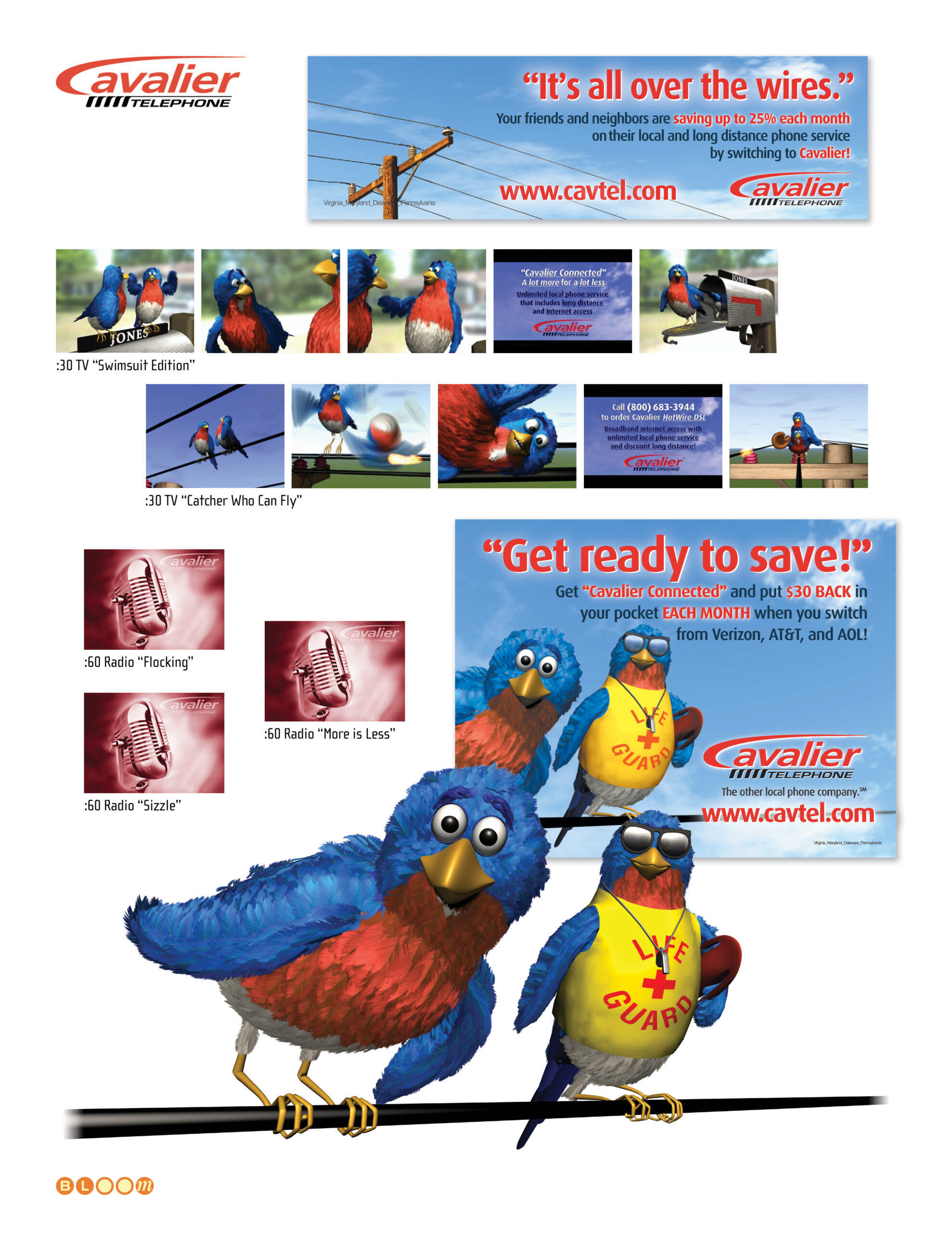
The campaign’s center of gravity was a fully realized 3D animated bluebird character — a concept I developed and brought to life through creative and production direction of a CGI animation partner. The bluebird was the perfect vehicle for the campaign: a creature that lives on telephone wires, speaks the language of the neighborhood, and carries the warmth and approachability that a challenger telephone brand needs to earn trust from residential customers. The character appeared across broadcast television, outdoor, and print in multiple executions and seasonal variations — the “Swimsuit Edition” and “Catcher Who Can Fly” :30 TV spots, the lifeguard bluebirds in the “Get Ready to Save!” print campaign, and the “It’s All Over the Wires” outdoor execution with the bluebird perched on the telephone wire that is, literally, the product.

The radio campaign — three :60 spots titled “Flocking,” “More is Less,” and “Sizzle” — was conceived, written, and produced by The Bloom Agency end-to-end. All three radio spots and the voice tracks for the animated TV commercials were recorded in a single session with a three-performer cast: narrator, player one, and player two. Recording both the radio and animation voices together with the same performers ensured complete consistency across every medium — the bluebird that audiences heard on radio was unmistakably the same character they watched on television. The animated commercials were subsequently composed and produced at a feature film production studio in Wilmington, North Carolina — a facility that happened to share its building with the production sets for Dawson’s Creek. I spent the better part of forty consecutive hours on a couch in the editing suite making sure every frame was right. The bluebird and the Creek, under the same roof.

The Cavalier Telephone logo was also refreshed and cleaned up as part of the engagement — tightening the letterforms and standardizing the mark to perform consistently across the full campaign media mix, from outdoor scale to broadcast lower thirds.

The campaign earned an ADDY Gold Award for Video/Film Effects Animation — recognition for the bluebird character work that anchored the entire effort. It remains one of the most fully integrated campaigns in The Bloom Agency’s history: a single character concept, expressed with equal confidence across broadcast, outdoor, print, and radio.

Campaign Concept, Character Design, Creative Direction, Animation Production Direction, Radio Creative, Radio Production, Print Advertising, Outdoor Advertising, Logo Refresh, Integrated Campaign Management

Lightscape Networks – XDM Launch Campaign

Lightscape Networks XDM launch campaign folio showing trade show booth graphics, print ads, direct mail, video stills, and collateral designed by The Bloom Agency — featuring the One Singular Sensation Broadway-themed campaign

In 2002, Morgan Stanley described Lightscape Networks as having “the finest converged product” in the metro optical transport market. What the Israeli-based ECI Telecom company lacked was a US market presence — and a trade show debut that would announce its arrival loudly enough to be heard over Cisco, Nortel, and a crowded field of surviving optical networking startups all competing for a finite pool of carrier capital spending.

The Bloom Agency was engaged to create the launch campaign for Lightscape’s XDM platform — a next-generation multi-service optical switch that combined SONET/SDH, DWDM, data switching, and digital cross-connect functionality into a single compact shelf — at the Optical Fiber Conference, one of the industry’s most significant annual gatherings. The strategic challenge was considerable: introduce a foreign manufacturer’s flagship product to a US audience already deeply invested in incumbent solutions, make it impossible to ignore at the show floor, and do it with the kind of creative confidence that signals a company ready to compete at the highest level.

The concept The Bloom Agency developed was “One Singular Sensation” — a deliberate Broadway reference that reframed Lightscape’s US debut as a theatrical opening night. The XDM’s core value proposition — one platform combining the functionality of multiple network layers — mapped perfectly onto the campaign line, which we carried across every touchpoint with consistent wit and visual energy. The concept was not just a headline. It was a fully produced campaign.

The video component was conceived and scripted entirely by The Bloom Agency. The production staged the XDM hardware as the sole performer on an auditorium stage — a wide-eyed director discovering its capabilities during a callback audition as the scene unfolds around it. Four booth attendant models dressed in authentic Broadway production costumes rented from a Los Angeles theatrical costume house completed the theatrical environment, presenting the hardware live against a booth backdrop featuring the production playing on continuous loop. The concept was fully committed: the XDM was the singular sensation, the trade show floor was opening night, and every engineer who stopped at booth 3912 was the audience.

The campaign extended across trade show booth graphics, print advertising, direct mail, conference collateral, and interactive display elements — all carrying the orange, navy, and black palette and the theatrical energy of the opening concept. The booth number — 3912 — became a recurring graphic element woven through the campaign, turning a logistical detail into a destination marker.

Lightscape’s XDM was, by most technical assessments, an exceptional product. The campaign we built for its US debut gave it an entrance worthy of that assessment. That the broader market battle ultimately went to entrenched incumbents is a story about timing and capital, not about the quality of the work — or the product.

Creative Direction, Campaign Concept, Art Direction, Trade Show Design, Print Advertising, Direct Mail, Video Production, Collateral Design

Yafo Networks — Identity, Website, and Print Design

Yafo Networks creative folio showing brand identity, cobalt and aqua wordmark with orbital ring logo, Netscape frames-based website design, PMD print advertising, Wake Up trade show campaign, direct mail, and seasonal greeting card designed by The Bloom Agency

The name was, by the founders’ own admission, a joke — YAFO: Yet Another Fiber Optic networking solutions company. It was the kind of self-aware humor that signals a technically confident team comfortable enough with the crowded optical networking landscape of the early 2000s to acknowledge it directly, because they knew they had something nobody else had cracked.

What they had was a solution to polarization mode dispersion — PMD — the signal degradation phenomenon that was blocking telecommunications carriers from upgrading their existing fiber infrastructure to 40 Gbps speeds. The alternative to solving PMD was replacing the fiber. YAFO’s hardware and software compensation technology meant carriers could maximize the utility of their current assets instead. Founded in June 1999 by Henry Yaffe in Hanover, Maryland, the company raised $61 million in venture capital across three rounds before its acquisition by Ciena Corporation — a validation of both the technology and the market timing.

The Bloom Agency was engaged for the full creative scope of YAFO’s marketing communications: identity design, website design, print advertising, trade show campaign, direct mail, and corporate collateral — all of it built in the compressed, capital-intensive atmosphere of the early 2000s optical networking market.

The Yafo logo is my design — a lowercase wordmark in a deep cobalt and aqua palette, with an orbital ring element arcing over the o. The ring is a deliberate double reference: to the optical lenses at the heart of the technology, and to the high-speed networking rings the product was designed to liberate. Light moving through glass at extraordinary speed, made visible in a single typographic gesture.

The website was designed in frames-based architecture for Netscape — the production reality of early 2000s web development — with a full site structure covering corporate strategy, management team, product information, a PMD Resource educational center, press coverage, and investor relations. Getting technical depth and marketing clarity to coexist in that environment required both design discipline and genuine understanding of what the product actually did and why it mattered.

The trade show campaign for SuperComm 2001 — Booth 8316 — was anchored by the “It’s Time to Wake Up!” concept, built around the insight that the industry was sleeping on the PMD problem at 40 Gbps while YAFO had already solved it. The campaign extended across print advertising, trade show materials, and a direct mail invitation that arrived sealed with a coffee-flavored scratch and sniff sticker. The concept and the execution were in complete alignment: every recipient who scratched that seal understood the campaign before they read a word. The greyhound billboard composite — an early Photoshop background replacement technique used as a campaign visualization — rounded out the competitive speed messaging.

The seasonal greeting card completed the relationship collateral — a snowman assembled from the Yafo orbital ring elements, wishing clients and partners happiness and success in the New Year with the same quiet wit that named the company in the first place.

Brand Identity, Logo Design, Orbital Ring Illustration, Website Design, Frames Architecture, Print Advertising, Trade Show Campaign, Direct Mail, Scratch and Sniff Production, Corporate Collateral, Seasonal Greeting Card, Production Management

Boar’s Head Inn — Advertising Campaign and Photography Direction

Boar's Head Inn advertising campaign folio showing segmented print ads for leisure escape, meetings, dining, and spa markets — all anchored by the It's at the heart of our charming inn campaign line — creative direction and photography direction by Keith Bloom for The Meridian Group

The Boar’s Head Inn in Charlottesville, Virginia occupies a particular position in the Mid-Atlantic hospitality landscape — a AAA Four Diamond country resort affiliated with the University of Virginia, set against the Blue Ridge Mountains, with an Old Mill Room dining room that had earned 16 consecutive Four Diamond awards, an intimate spa, championship golf, and meeting facilities capable of hosting groups that demand both professional-grade conference infrastructure and the kind of unhurried elegance that only a genuine country inn provides. The positioning line said it plainly: a country resort at the University of Virginia. The creative challenge was to make each of the inn’s distinct offerings feel like the primary reason to go — without any of them contradicting the others.

Serving as creative director, account executive, and photography director as a contractor through The Meridian Group, I developed and produced a segmented print advertising campaign system built around a single unifying campaign line: “It’s at the heart of our charming inn.” The line did precisely what a good campaign line should — it answered every question the campaign asked while reinforcing the inn’s essential character with each repetition. Each ad led with a direct question addressed to a specific audience motivation, then answered it with the same quiet confidence.

For the leisure escape market: “Looking for a Captivating Blue Ridge Resort Escape?” For the meetings market: “Looking for an Unrivaled Resort Meeting Destination?” For the dining market: “Looking for an Epicurean Destination?” — with the Old Mill Room’s 16 consecutive AAA Four Diamond Awards doing the persuasion work in the body copy. For the spa market: “Looking for Your Own Personal Oasis?” — accompanied by a $99 Lavender Salt Body Scrub promotional piece that made the spa feel accessible as well as luxurious. Rate promotional executions — Summer Midweek Rates from $139, Summer Sunday Brunch at $49 — completed the system, giving the campaign direct response capability alongside the brand advertising.

Photography direction was conducted on location at the resort — a more extensive production than the parallel Kingsmill Resort engagement, involving both property photography and model setups across the guest rooms, the Old Mill Room dining room, the spa treatment areas, the fireside sitting areas, and the grounds. Each setup was directed to carry the warmth, intimacy, and unhurried quality that the campaign line promised. The photography didn’t illustrate the ads. It was the ads.

Creative Direction, Photography Direction, Account Executive, Print Advertising, Rate Promotional Advertising, Segmented Market Campaigns, Print Production Management

Kingsmill Resort — Advertising Campaigns, Photography Direction

Kingsmill Resort advertising campaign folio showing corporate meetings print ads, defense industry We Can Keep a Secret campaign, Fortune 500 advertising, Travel Channel Top Ten family resort ad, and direct mail pieces — creative direction and photography direction by Keith Bloom

Kingsmill Resort in Williamsburg, Virginia — an Anheuser-Busch resort property on the James River — is one of the Mid-Atlantic region’s premier conference and leisure destinations: 16 dedicated meeting rooms certified by the International Association of Conference Centers, three championship golf courses, a European-style spa, award-winning culinary staff, and within easy reach of Busch Gardens, Water Country USA, and Colonial Williamsburg. Marketing a property with that range of offerings to audiences as different as Fortune 500 meeting planners, defense industry procurement officers, and family vacation travelers requires not one campaign but several — each speaking with precision to a distinctly different set of motivations.

Serving as creative director and account executive for the Kingsmill account as a contractor through The Meridian Group, I developed and produced a segmented print advertising campaign system that addressed each audience on its own terms while maintaining the visual coherence and brand authority of the Kingsmill identity.

For the corporate meetings market, the campaign led with the pressure and consequence that meeting planners carry: “Medical Breakthroughs Don’t Happen Overnight. But Your Next Meeting Can.” and “How Some Fortune 500 Companies Got to Be So Fortunate.” — direct, confident lines that spoke to the decision-maker’s professional responsibility rather than the resort’s amenities. The amenities were listed in the body copy. The headline earned the read.

The defense and government market campaign was perhaps the most conceptually precise piece in the collection. Defense-related groups meeting at a resort need discretion as much as they need conference facilities — and “We Can Keep a Secret” acknowledged that need directly, with a supporting piece listing defense industry clients whose identities were, of course, redacted. It’s a campaign that works precisely because it demonstrates the thing it promises.

For the family leisure market, the campaign leveraged Kingsmill’s Travel Channel Top Ten Family Resort recognition — “You’re Number One at this Travel Channel Top Ten Family Resort” — turning a third-party credential into a consumer-facing headline that did the persuasion work efficiently and credibly.

Photography direction for both the meetings and accommodations campaigns was my responsibility, conducted on location at the resort. The conference room imagery, the resort property photography, and the accommodations visuals were all directed to serve the specific campaign they appeared in — the meetings photography communicating professional-grade facility quality, the leisure photography communicating the warmth and ease of a family destination.

Creative Direction, Account Executive, Photography Direction, Print Advertising, Direct Mail, Campaign Strategy, Segmented Market Campaigns, Print Production Management