Lightscape Networks – XDM Launch Campaign

Lightscape Networks XDM launch campaign folio showing trade show booth graphics, print ads, direct mail, video stills, and collateral designed by The Bloom Agency — featuring the One Singular Sensation Broadway-themed campaign

In 2002, Morgan Stanley described Lightscape Networks as having “the finest converged product” in the metro optical transport market. What the Israeli-based ECI Telecom company lacked was a US market presence — and a trade show debut that would announce its arrival loudly enough to be heard over Cisco, Nortel, and a crowded field of surviving optical networking startups all competing for a finite pool of carrier capital spending.

The Bloom Agency was engaged to create the launch campaign for Lightscape’s XDM platform — a next-generation multi-service optical switch that combined SONET/SDH, DWDM, data switching, and digital cross-connect functionality into a single compact shelf — at the Optical Fiber Conference, one of the industry’s most significant annual gatherings. The strategic challenge was considerable: introduce a foreign manufacturer’s flagship product to a US audience already deeply invested in incumbent solutions, make it impossible to ignore at the show floor, and do it with the kind of creative confidence that signals a company ready to compete at the highest level.

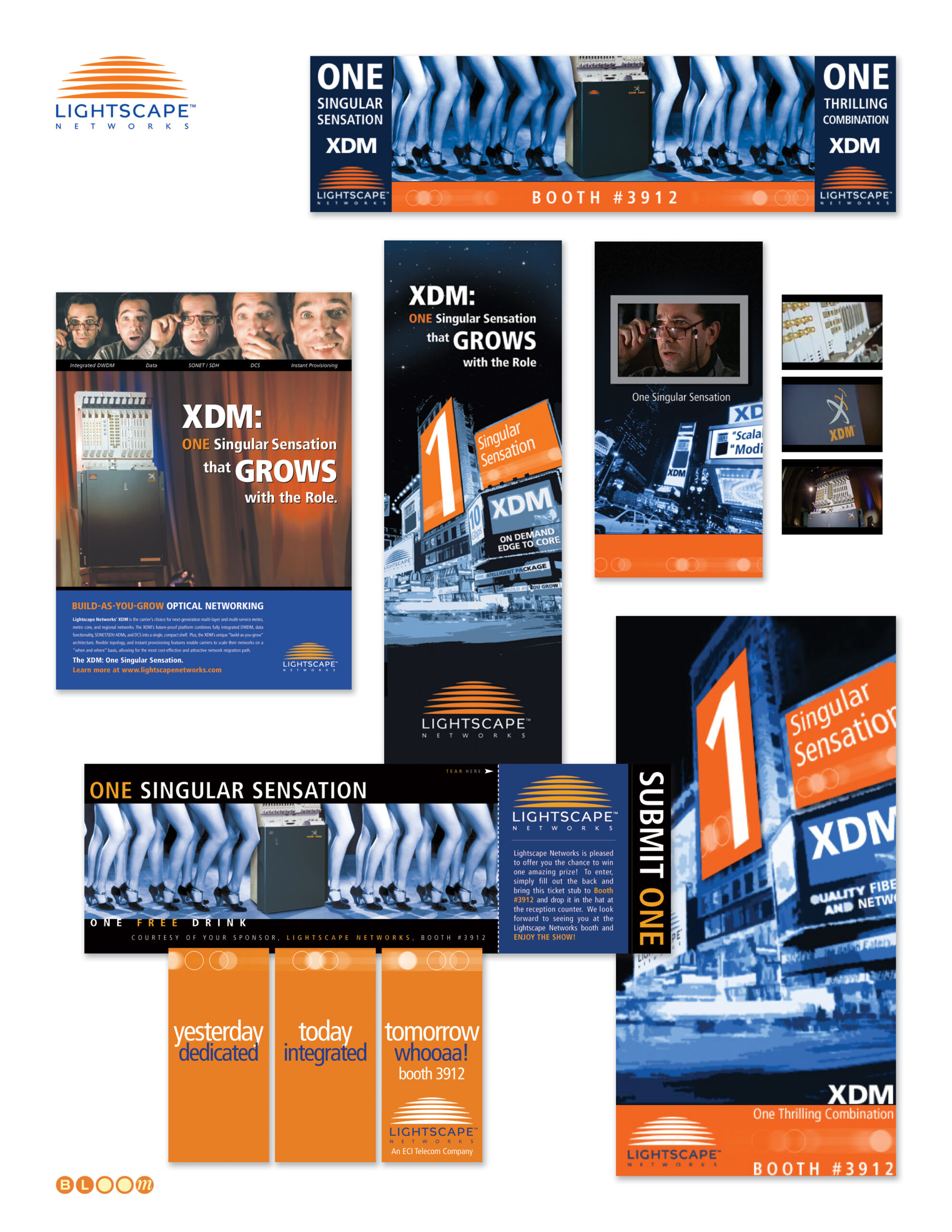
The concept The Bloom Agency developed was “One Singular Sensation” — a deliberate Broadway reference that reframed Lightscape’s US debut as a theatrical opening night. The XDM’s core value proposition — one platform combining the functionality of multiple network layers — mapped perfectly onto the campaign line, which we carried across every touchpoint with consistent wit and visual energy. The concept was not just a headline. It was a fully produced campaign.

The video component was conceived and scripted entirely by The Bloom Agency. The production staged the XDM hardware as the sole performer on an auditorium stage — a wide-eyed director discovering its capabilities during a callback audition as the scene unfolds around it. Four booth attendant models dressed in authentic Broadway production costumes rented from a Los Angeles theatrical costume house completed the theatrical environment, presenting the hardware live against a booth backdrop featuring the production playing on continuous loop. The concept was fully committed: the XDM was the singular sensation, the trade show floor was opening night, and every engineer who stopped at booth 3912 was the audience.

The campaign extended across trade show booth graphics, print advertising, direct mail, conference collateral, and interactive display elements — all carrying the orange, navy, and black palette and the theatrical energy of the opening concept. The booth number — 3912 — became a recurring graphic element woven through the campaign, turning a logistical detail into a destination marker.

Lightscape’s XDM was, by most technical assessments, an exceptional product. The campaign we built for its US debut gave it an entrance worthy of that assessment. That the broader market battle ultimately went to entrenched incumbents is a story about timing and capital, not about the quality of the work — or the product.

Creative Direction, Campaign Concept, Art Direction, Trade Show Design, Print Advertising, Direct Mail, Video Production, Collateral Design

Yafo Networks — Identity, Website, and Print Design

Yafo Networks creative folio showing brand identity, cobalt and aqua wordmark with orbital ring logo, Netscape frames-based website design, PMD print advertising, Wake Up trade show campaign, direct mail, and seasonal greeting card designed by The Bloom Agency

The name was, by the founders’ own admission, a joke — YAFO: Yet Another Fiber Optic networking solutions company. It was the kind of self-aware humor that signals a technically confident team comfortable enough with the crowded optical networking landscape of the early 2000s to acknowledge it directly, because they knew they had something nobody else had cracked.

What they had was a solution to polarization mode dispersion — PMD — the signal degradation phenomenon that was blocking telecommunications carriers from upgrading their existing fiber infrastructure to 40 Gbps speeds. The alternative to solving PMD was replacing the fiber. YAFO’s hardware and software compensation technology meant carriers could maximize the utility of their current assets instead. Founded in June 1999 by Henry Yaffe in Hanover, Maryland, the company raised $61 million in venture capital across three rounds before its acquisition by Ciena Corporation — a validation of both the technology and the market timing.

The Bloom Agency was engaged for the full creative scope of YAFO’s marketing communications: identity design, website design, print advertising, trade show campaign, direct mail, and corporate collateral — all of it built in the compressed, capital-intensive atmosphere of the early 2000s optical networking market.

The Yafo logo is my design — a lowercase wordmark in a deep cobalt and aqua palette, with an orbital ring element arcing over the o. The ring is a deliberate double reference: to the optical lenses at the heart of the technology, and to the high-speed networking rings the product was designed to liberate. Light moving through glass at extraordinary speed, made visible in a single typographic gesture.

The website was designed in frames-based architecture for Netscape — the production reality of early 2000s web development — with a full site structure covering corporate strategy, management team, product information, a PMD Resource educational center, press coverage, and investor relations. Getting technical depth and marketing clarity to coexist in that environment required both design discipline and genuine understanding of what the product actually did and why it mattered.

The trade show campaign for SuperComm 2001 — Booth 8316 — was anchored by the “It’s Time to Wake Up!” concept, built around the insight that the industry was sleeping on the PMD problem at 40 Gbps while YAFO had already solved it. The campaign extended across print advertising, trade show materials, and a direct mail invitation that arrived sealed with a coffee-flavored scratch and sniff sticker. The concept and the execution were in complete alignment: every recipient who scratched that seal understood the campaign before they read a word. The greyhound billboard composite — an early Photoshop background replacement technique used as a campaign visualization — rounded out the competitive speed messaging.

The seasonal greeting card completed the relationship collateral — a snowman assembled from the Yafo orbital ring elements, wishing clients and partners happiness and success in the New Year with the same quiet wit that named the company in the first place.

Brand Identity, Logo Design, Orbital Ring Illustration, Website Design, Frames Architecture, Print Advertising, Trade Show Campaign, Direct Mail, Scratch and Sniff Production, Corporate Collateral, Seasonal Greeting Card, Production Management