Catering by Windows — Advertising and Print Collateral Design

Catering by Windows French menu system folio showing high-key food photography, elegant white space grid layout, and warm typography designed by Keith Bloom for their flagship catering menu

Catering by Windows was one of Washington DC’s premier full-service catering and event companies — capable of producing an elaborate tented dinner for 300 or an intimate luncheon for 20, with equal attention to elegance, detail, and the particular personality of each occasion. The brief called for printed materials that communicated that range without sacrificing the visual sophistication their clientele expected.

The Bloom Agency handled advertising, catering menu design, and event catalog production for Catering by Windows’ flagship printed collateral — a sustained engagement across multiple major projects in the early 2000s. The work spans two distinct visual registers that speak to the breadth of the client’s offering: a refined, high-key French menu system built around clean white space, warm typography, and intimate food photography; and a rich, jewel-toned wedding and special events collection anchored by dramatic tablescapes, tiered wedding cakes, and the quietly confident campaign line “We do…” — two words that do everything simultaneously.

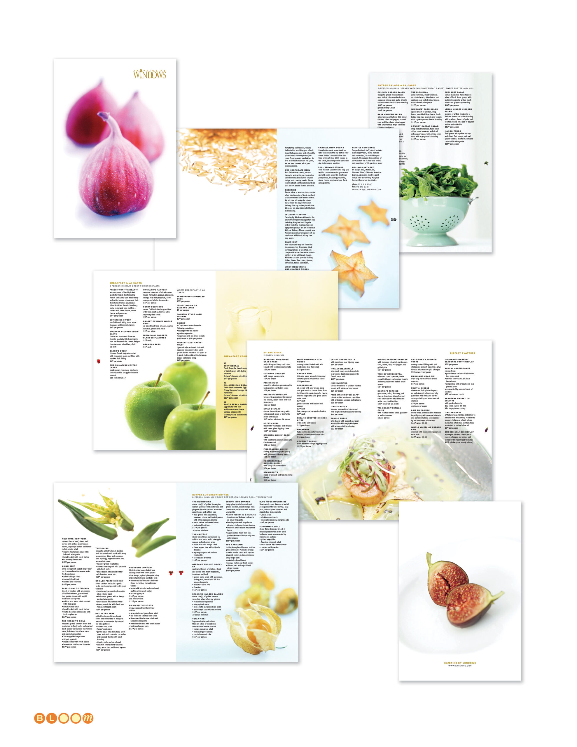
Photography direction for both systems was my responsibility, conducted on location in Catering by Windows’ facility showrooms and commercial kitchens. Getting food and event photography right at this level requires more than a skilled photographer — it requires someone who understands both the visual language of luxury hospitality and the specific story each image needs to carry within the larger collateral system. The fig imagery that anchors the French menu system, the candlelit tablescapes in the wedding brochure, the precise arrangement of prepared dishes in the catering catalog — all of it was directed and produced to serve the design rather than the other way around.

The engagement also included a co-branded collateral piece for Catering by Giant — a partnership between Catering by Windows and Giant Food that required a dedicated sub-brand identity and marketing materials carrying both partners’ visual presence with coherence and appropriate hierarchy.

Across both folios the Windows logotype — a custom wordmark in which the double-O carries a distinctive window pane graphic — anchored a consistent brand presence through every format, from full-size event catalogs and multi-panel brochures to direct mail and advertising pieces.

Creative Direction; Photography Direction; Copy Writing; Production Management; Account Executive

GATF/PIA — D4D: Variable Data Digital Printing Campaign

GATF PIA D4D Designing for Digital campaign folio showing three variable data poster concepts — Age of Variable Data Digital Printing bicycle poster, It's Not Just Business It's Personal motorcycle poster, and Make Each of Your Customers Feel Like a Star Hollywood Walk of Fame poster — creative direction and variable data template engineering by Keith Bloom at The Bloom Agency

In September 2001, HP announced its acquisition of Indigo N.V. for approximately $882 million — absorbing the Israeli company that had pioneered digital printing technology and bringing variable data digital printing into the mainstream of the global printing industry. Print Expo 2001 was held at precisely this inflection point, and the Graphic Arts Technical Foundation and Printing Industries of America chose it as the moment to demonstrate to the industry exactly what this technology could do in the hands of a skilled creative team.

The Bloom Agency was engaged to create that demonstration. As creative director, photography director, and account executive, I conceived and engineered the D4D — Designing for Digital — campaign from the ground up: a live variable data printing experience in which trade show attendees entered their name at a kiosk, selected one of three custom poster concepts, and received a full-color 11×17 personalized poster on heavy stock, rolled into a tube and ready to take home, printed in minutes on HP Indigo technology. It was one of the earliest large-scale public demonstrations of variable data digital printing as a consumer-facing creative experience.

The three poster concepts were each specifically composed and photographed to accept dynamically inserted personalized names with photo-realistic perspective and distortion — not as obvious overlays, but as elements that appeared physically present in the image. This required precise engineering of what I called type envelopes: carefully constructed zones within each photograph that controlled the perspective geometry and surface texture the variable text would need to match. Getting a name to read as if it were actually stamped on a bicycle license plate, engraved on a motorcycle plate, or embedded in a Hollywood Walk of Fame star required the photography to be built around the variable data mechanics from the first frame.

All three background images were conceived and produced specifically for this project. The bicycle and motorcycle were rented props, photographed in a studio in Silver Spring, Maryland. The Hollywood Walk of Fame star — “Make Each of Your Customers Feel Like a Star” — was shot in the lobby of the GATF building in Alexandria, Virginia, with the feet of one of my art directors standing at the edge of the star. Every inch of every image was designed to serve the production requirement.

The campaign was well received at Print Expo 2001 — but the show unfolded against an extraordinary backdrop. Print Expo 2001 was held in Chicago, and the attacks of September 11, 2001 occurred during the run of the show. The exhibition continued, attendees collected their personalized posters, and the demonstration of what variable data digital printing could do landed as intended — but the closing of US airspace in the days that followed left the client stranded in Chicago, unable to return home for several days. It is one of those production stories that sits permanently in the shadow of a larger event.

I was not present at the expo itself. The campaign was delivered into the capable hands of the client team for the show floor execution.

The campaign line was “The Age of Variable-Data Digital Printing” — and at Print Expo 2001, standing at the moment HP was absorbing Indigo and the industry was absorbing what that meant, it wasn’t a claim. It was a demonstration.

Creative Direction, Photography Direction, Account Executive, Variable Data Template Design and Engineering, Dynamic Type Envelope Architecture, Prop Photography

Blueprint Magazine

Blueprint Magazine folio showing multiple quarterly issue covers and interior spreads designed by The Bloom Agency for the Democratic Leadership Council, including the Education and Quality of Life issues

Blueprint was the flagship publication of the Democratic Leadership Council — the centrist policy organization that defined the New Democrat movement and provided much of the intellectual infrastructure of the Clinton presidency. Subtitled Ideas for a New Century and published under the DLC’s The New Democrat banner, it was a serious policy journal with an editorial roster that read like a roll call of the era’s most consequential centrist voices: senators, congressmen, governors, mayors, and cabinet secretaries contributing to a national conversation about a third way forward for American politics and economic life.

The Bloom Agency was contracted to launch Blueprint from the ground up and manage its full creative production for two years. As founder and creative director, I designed the Blueprint masthead and typographic identity — a confident condensed sans-serif wordmark in cobalt blue that established the magazine’s visual authority from its first issue. I assembled and led the agency team responsible for layout and production, defining the typographic system, cover design language, and interior grid that gave Blueprint its consistent editorial voice across eight quarterly issues. Each cover was designed to carry real visual impact — the Education issue’s bold “adults vs. kids?” challenge, the Quality of Life issue’s full-bleed display type against urban imagery — while the masthead remained a steady, recognizable anchor throughout.

Over the two-year engagement, we systematized every aspect of the production workflow to the point where it could be transitioned seamlessly to an in-house team at the DLC — which it was, as a cost-saving measure after the contract concluded. Launching a publication, running it at a high creative standard for two years, and handing off a fully documented, production-ready operation is a different kind of creative responsibility than a single design engagement. Blueprint was all three.

Masthead Design, Visual Identity, Creative Direction, Typography Design, Team Assembly and Management, Print Production Management — 8 Quarterly Issues

CarrAmerica — Brand Standards, Property Marketing, Print Collateral

CarrAmerica brand standards and property marketing folio showing graphic standards manual pages, property leasing brochures for Tollway Plaza, Hamilton Square, Redmond East Business Campus and Fairfax Corporate Park, floor plan production, CarrWorkplaces newsletter, seasonal greeting card, and print advertising — designed and produced by The Bloom Agency

CarrAmerica was one of the largest publicly traded office real estate investment trusts in the United States in the mid-1990s, operating commercial properties across major markets including Washington DC, Dallas, and the Pacific Northwest under the tagline “America’s Workplace.” Managing a national property portfolio at that scale requires more than a recognizable logo — it requires a brand system rigorous enough to govern every leasing brochure, every property advertisement, every floor plan package, and every piece of tenant communication across dozens of properties in multiple markets, produced consistently by different teams in different cities.

The Bloom Agency was engaged to formalize, document, and extend CarrAmerica’s existing brand identity into a reproducible graphic standards system — taking a light existing framework and building it into a comprehensive set of rules governing typography, layout dimensions, color application, marketing materials production, and collateral specifications across every format the organization used. The standards manual became the definitive reference for CarrAmerica’s marketing communications: every measurement specified, every typeface documented, every layout grid defined, so that the brand could be reproduced consistently whether the property was in Dallas, Redmond, or downtown Washington DC.

That system was then applied across a sustained engagement producing the full spectrum of CarrAmerica’s marketing collateral. Individual property leasing packages — each one a self-contained marketing document for a specific building or campus — were designed and produced for properties including Tollway Plaza in Dallas, Redmond East Business Campus in the Pacific Northwest, Hamilton Square on 14th Street in Washington DC, and Fairfax Corporate Park in Northern Virginia. Each package carried its own visual character appropriate to its market and property type while remaining unmistakably within the CarrAmerica brand framework.

The floor plan production work was particularly exacting — architectural floor plans rendered and formatted for leasing materials, with multi-tenant layout variations showing different configuration options for prospective tenants. Getting floor plans to read clearly and persuasively as marketing documents, rather than merely as technical drawings, requires a specific kind of visual intelligence that sits at the intersection of information design and brand communication.

The engagement also produced the CarrWorkplaces newsletter system, a seasonal corporate greeting card program, print advertising for available space across the portfolio, and a standardized leasing inquiry response and fulfillment package system — the complete communications infrastructure of a national commercial real estate operation.

Brand Standards Formalization, Documentation and Extension, Graphic Standards Manual, Property Leasing Brochures, Floor Plan Production, Print Advertising, Newsletter Design, Corporate Communications, Collateral Design, Print Production Management