Kingsmill Resort — Advertising Campaigns, Photography Direction

Kingsmill Resort advertising campaign folio showing corporate meetings print ads, defense industry We Can Keep a Secret campaign, Fortune 500 advertising, Travel Channel Top Ten family resort ad, and direct mail pieces — creative direction and photography direction by Keith Bloom

Kingsmill Resort in Williamsburg, Virginia — an Anheuser-Busch resort property on the James River — is one of the Mid-Atlantic region’s premier conference and leisure destinations: 16 dedicated meeting rooms certified by the International Association of Conference Centers, three championship golf courses, a European-style spa, award-winning culinary staff, and within easy reach of Busch Gardens, Water Country USA, and Colonial Williamsburg. Marketing a property with that range of offerings to audiences as different as Fortune 500 meeting planners, defense industry procurement officers, and family vacation travelers requires not one campaign but several — each speaking with precision to a distinctly different set of motivations.

Serving as creative director and account executive for the Kingsmill account as a contractor through The Meridian Group, I developed and produced a segmented print advertising campaign system that addressed each audience on its own terms while maintaining the visual coherence and brand authority of the Kingsmill identity.

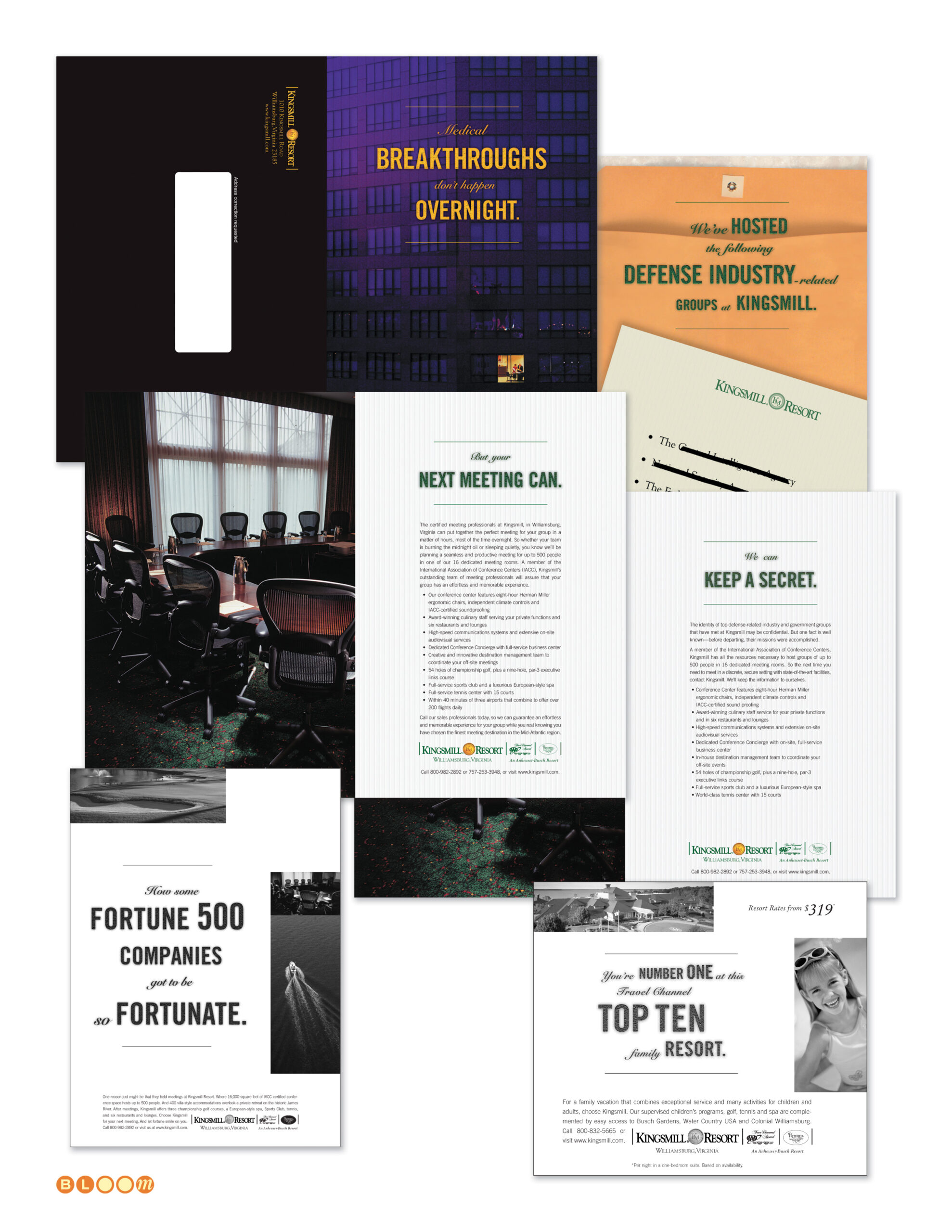
For the corporate meetings market, the campaign led with the pressure and consequence that meeting planners carry: “Medical Breakthroughs Don’t Happen Overnight. But Your Next Meeting Can.” and “How Some Fortune 500 Companies Got to Be So Fortunate.” — direct, confident lines that spoke to the decision-maker’s professional responsibility rather than the resort’s amenities. The amenities were listed in the body copy. The headline earned the read.

The defense and government market campaign was perhaps the most conceptually precise piece in the collection. Defense-related groups meeting at a resort need discretion as much as they need conference facilities — and “We Can Keep a Secret” acknowledged that need directly, with a supporting piece listing defense industry clients whose identities were, of course, redacted. It’s a campaign that works precisely because it demonstrates the thing it promises.

For the family leisure market, the campaign leveraged Kingsmill’s Travel Channel Top Ten Family Resort recognition — “You’re Number One at this Travel Channel Top Ten Family Resort” — turning a third-party credential into a consumer-facing headline that did the persuasion work efficiently and credibly.

Photography direction for both the meetings and accommodations campaigns was my responsibility, conducted on location at the resort. The conference room imagery, the resort property photography, and the accommodations visuals were all directed to serve the specific campaign they appeared in — the meetings photography communicating professional-grade facility quality, the leisure photography communicating the warmth and ease of a family destination.

Creative Direction, Account Executive, Photography Direction, Print Advertising, Direct Mail, Campaign Strategy, Segmented Market Campaigns, Print Production Management

Blueprint Magazine

Blueprint Magazine folio showing multiple quarterly issue covers and interior spreads designed by The Bloom Agency for the Democratic Leadership Council, including the Education and Quality of Life issues

Blueprint was the flagship publication of the Democratic Leadership Council — the centrist policy organization that defined the New Democrat movement and provided much of the intellectual infrastructure of the Clinton presidency. Subtitled Ideas for a New Century and published under the DLC’s The New Democrat banner, it was a serious policy journal with an editorial roster that read like a roll call of the era’s most consequential centrist voices: senators, congressmen, governors, mayors, and cabinet secretaries contributing to a national conversation about a third way forward for American politics and economic life.

The Bloom Agency was contracted to launch Blueprint from the ground up and manage its full creative production for two years. As founder and creative director, I designed the Blueprint masthead and typographic identity — a confident condensed sans-serif wordmark in cobalt blue that established the magazine’s visual authority from its first issue. I assembled and led the agency team responsible for layout and production, defining the typographic system, cover design language, and interior grid that gave Blueprint its consistent editorial voice across eight quarterly issues. Each cover was designed to carry real visual impact — the Education issue’s bold “adults vs. kids?” challenge, the Quality of Life issue’s full-bleed display type against urban imagery — while the masthead remained a steady, recognizable anchor throughout.

Over the two-year engagement, we systematized every aspect of the production workflow to the point where it could be transitioned seamlessly to an in-house team at the DLC — which it was, as a cost-saving measure after the contract concluded. Launching a publication, running it at a high creative standard for two years, and handing off a fully documented, production-ready operation is a different kind of creative responsibility than a single design engagement. Blueprint was all three.

Masthead Design, Visual Identity, Creative Direction, Typography Design, Team Assembly and Management, Print Production Management — 8 Quarterly Issues

Screen47.com — “We’re Rolling”

screen47.com campaign folio showing logo, Netscape 2.0 website UI designs, print advertising, direct mail, and Flash interactive elements created by The Bloom Agency — featuring the We're Rolling campaign line and Ebert and Roeper partnership

Before YouTube. Before broadband made streaming viable for the average household. Before anyone had coined the term user-generated content. There was screen47.com — a concept so ahead of its moment that the infrastructure to support it simply did not yet exist at the scale required.

The Bloom Agency was engaged to create the complete brand identity, website design, and marketing campaign for screen47.com — a global venue for independent filmmakers to submit, stream, and distribute their work to audiences worldwide, free of charge. The platform’s value proposition was elegant and genuinely radical for its time: you submit your film, we handle the distribution, the digitizing, the streaming, the audience building. Your film. Coming soon to screens everywhere.

The name encoded a quiet piece of conceptual depth — 47 is the atomic number of silver, a reference to the silver screen, tying a digital-native platform back to the physical poetry of cinema with a single numeral. The logo’s orbital ring system around that numeral suggested both planetary motion and content in perpetual circulation — a mark designed for a medium that hadn’t fully arrived yet.

The agency created the “We’re Rolling” campaign line — a phrase that does three things simultaneously: signals that the cameras are running, that the platform is live, and that the business has momentum. It ran across print advertising, direct mail, and the website UI itself, anchoring a visual system built in Netscape 2.0 that anticipated the streaming era with remarkable clarity.

The campaign attracted genuine institutional credibility. Film critics Roger Ebert and Richard Roeper were not merely conceptual supporters — they provided filmed endorsements specifically to support the client’s venture capital fundraising effort. That level of editorial endorsement for a platform concept that hadn’t yet reached scale speaks to how compelling the idea was to people who understood the future of film distribution.

A working demo of the site was built and demonstrated. The obstacle was not the concept, not the design, not the endorsements, and not the market appetite. It was bandwidth economics — access costs and service capacity made viable streaming prohibitively expensive at the scale required for the platform to gain real traction. The client ran out of runway before the infrastructure caught up. A competitor with a longer war chest and better timing eventually built the same idea and called it YouTube.

The work remains one of the most forward-looking engagements in The Bloom Agency’s history — and a reminder that being right about the future is not always enough.

Brand Identity, Logo Design, Campaign Concept, Tagline Development, Website Design, Print Advertising, Direct Mail, Interactive Design, Flash Production

CarrAmerica — Brand Standards, Property Marketing, Print Collateral

CarrAmerica brand standards and property marketing folio showing graphic standards manual pages, property leasing brochures for Tollway Plaza, Hamilton Square, Redmond East Business Campus and Fairfax Corporate Park, floor plan production, CarrWorkplaces newsletter, seasonal greeting card, and print advertising — designed and produced by The Bloom Agency

CarrAmerica was one of the largest publicly traded office real estate investment trusts in the United States in the mid-1990s, operating commercial properties across major markets including Washington DC, Dallas, and the Pacific Northwest under the tagline “America’s Workplace.” Managing a national property portfolio at that scale requires more than a recognizable logo — it requires a brand system rigorous enough to govern every leasing brochure, every property advertisement, every floor plan package, and every piece of tenant communication across dozens of properties in multiple markets, produced consistently by different teams in different cities.

The Bloom Agency was engaged to formalize, document, and extend CarrAmerica’s existing brand identity into a reproducible graphic standards system — taking a light existing framework and building it into a comprehensive set of rules governing typography, layout dimensions, color application, marketing materials production, and collateral specifications across every format the organization used. The standards manual became the definitive reference for CarrAmerica’s marketing communications: every measurement specified, every typeface documented, every layout grid defined, so that the brand could be reproduced consistently whether the property was in Dallas, Redmond, or downtown Washington DC.

That system was then applied across a sustained engagement producing the full spectrum of CarrAmerica’s marketing collateral. Individual property leasing packages — each one a self-contained marketing document for a specific building or campus — were designed and produced for properties including Tollway Plaza in Dallas, Redmond East Business Campus in the Pacific Northwest, Hamilton Square on 14th Street in Washington DC, and Fairfax Corporate Park in Northern Virginia. Each package carried its own visual character appropriate to its market and property type while remaining unmistakably within the CarrAmerica brand framework.

The floor plan production work was particularly exacting — architectural floor plans rendered and formatted for leasing materials, with multi-tenant layout variations showing different configuration options for prospective tenants. Getting floor plans to read clearly and persuasively as marketing documents, rather than merely as technical drawings, requires a specific kind of visual intelligence that sits at the intersection of information design and brand communication.

The engagement also produced the CarrWorkplaces newsletter system, a seasonal corporate greeting card program, print advertising for available space across the portfolio, and a standardized leasing inquiry response and fulfillment package system — the complete communications infrastructure of a national commercial real estate operation.

Brand Standards Formalization, Documentation and Extension, Graphic Standards Manual, Property Leasing Brochures, Floor Plan Production, Print Advertising, Newsletter Design, Corporate Communications, Collateral Design, Print Production Management