Identity design is where my instincts are most exposed. There is nowhere to hide in a logo — every decision about form, weight, letter spacing, and concept is either right or it isn’t. The marks collected here span three decades, eight organizations, and a range of briefs as different from one another as their sectors. What connects them is a consistent design philosophy: type-driven, conceptually grounded, and built to work as hard as the organizations they represent.
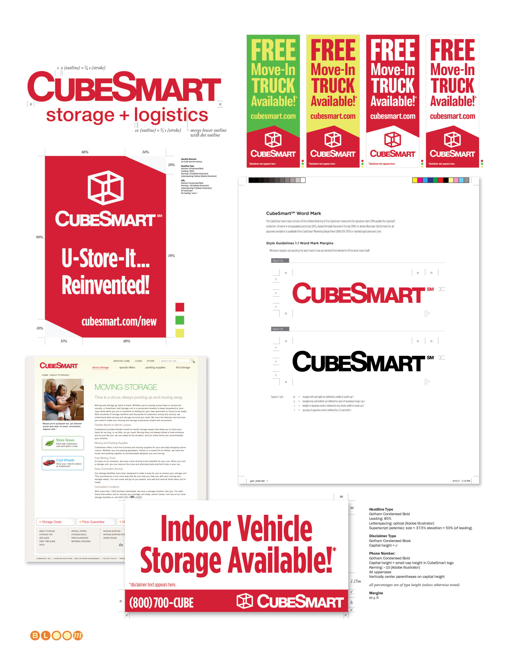
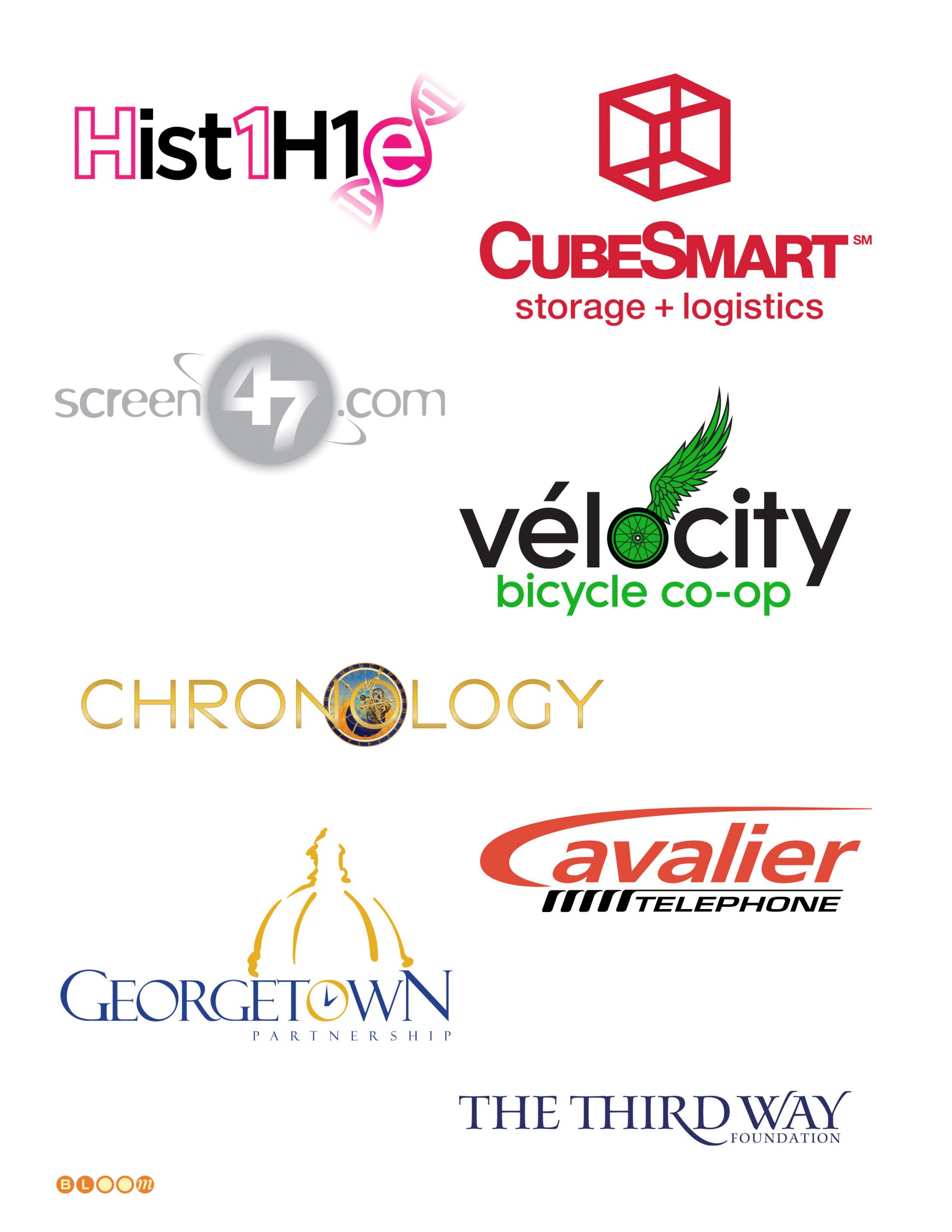
CubeSmart is the flagship engagement in this collection and one of the most visible pieces of work in my portfolio. Commissioned for a complete rebrand of the national self-storage company, the assignment began with the wordmark — custom-drawn letterforms with proprietary glyph modifications that give the mark its distinctive character and ensure it reads as a composed, unified whole rather than a typeface applied. The cubic icon above the wordmark is deceptively simple — a three-dimensional form that communicates storage, structure, and spatial intelligence in a single gesture. The engagement extended well beyond the mark itself into a comprehensive graphic standards manual covering architectural signage, building facade treatments, interactive advertising templates, and employee uniforms — the full spectrum of environmental and brand identity practice delivered as a single coherent system. CubeSmart remains in active national use today.
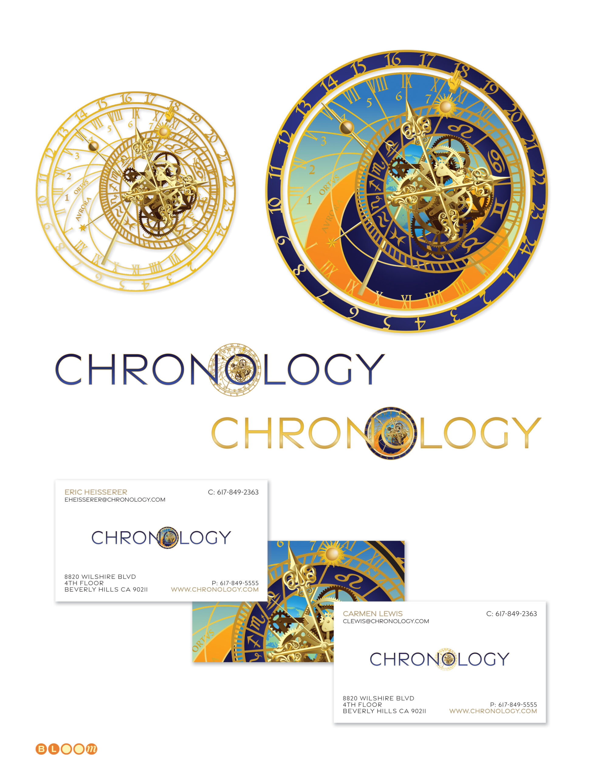
Chronology Productions — founded by Academy Award-nominated screenwriter Eric Heisserer — called for a mark that could live in a credit reel as naturally as on a business card. The solution draws from the Orloj, the historic astronomical clock in Prague’s Old Town Square, adapting its intricate medieval clockwork geometry into the letter O at the center of the wordmark. Set in elegant spaced capitals with a warm gold palette, the mark feels simultaneously cinematic and timeless — and was conceived from the outset for animation, the clockwork mechanism designed to turn.
Hist1H1e Foundation is the most personal mark in this collection. Created pro bono for a lifelong friend and his wife, the identity supports a worldwide community of parents, physicians, and researchers united around a rare pediatric genetic disorder. The wordmark encodes the syndrome’s clinical name directly — Hist1H1e — with the double helix of a DNA strand completing the final letterform. It is a mark designed to make something invisible visible, and to give a scattered global community a recognizable emblem to gather around.
Vélocity Bicycle Co-op is a passion project and an ongoing one — I currently serve on the board of directors of this Washington, DC-area 501(c)(3) and am the organization’s visual identity steward. The refresh standardized and refined the custom workmark letterforms, and added structural detail and historical depth to the winged wheel mark — an homage to the Campagnolo winged quick-release wheel composition patented in the 1930s, one of the most iconic artifacts in cycling design history. The accent on the é is deliberate, a nod to the French cycling tradition from which so much of the sport’s visual language descends.
screen47.com was a concept ahead of its moment — a user-generated streaming video platform designed in a Netscape 2.0 environment, before YouTube existed or broadband made such a thing commercially viable. The name encodes a quiet piece of chemistry: 47 is the atomic number of silver, a reference to the silver screen. The mark uses an orbital ring system around the numeral, suggesting both planetary motion and the then-nascent concept of content in orbit around a digital hub.
Georgetown Partnership represents the business and civic interests of one of Washington’s most historically distinct neighborhoods. The mark draws its central image from the golden dome and cupola of the Farmers and Mechanics Bank at Wisconsin and M Streets NW — one of Georgetown’s most recognizable architectural landmarks — rendered in a warm gold that references the building’s gilded presence at that corner. The mark speaks directly to the audiences the Partnership engages: city and federal officials who understand immediately that this organization speaks for a neighborhood with real historical standing.
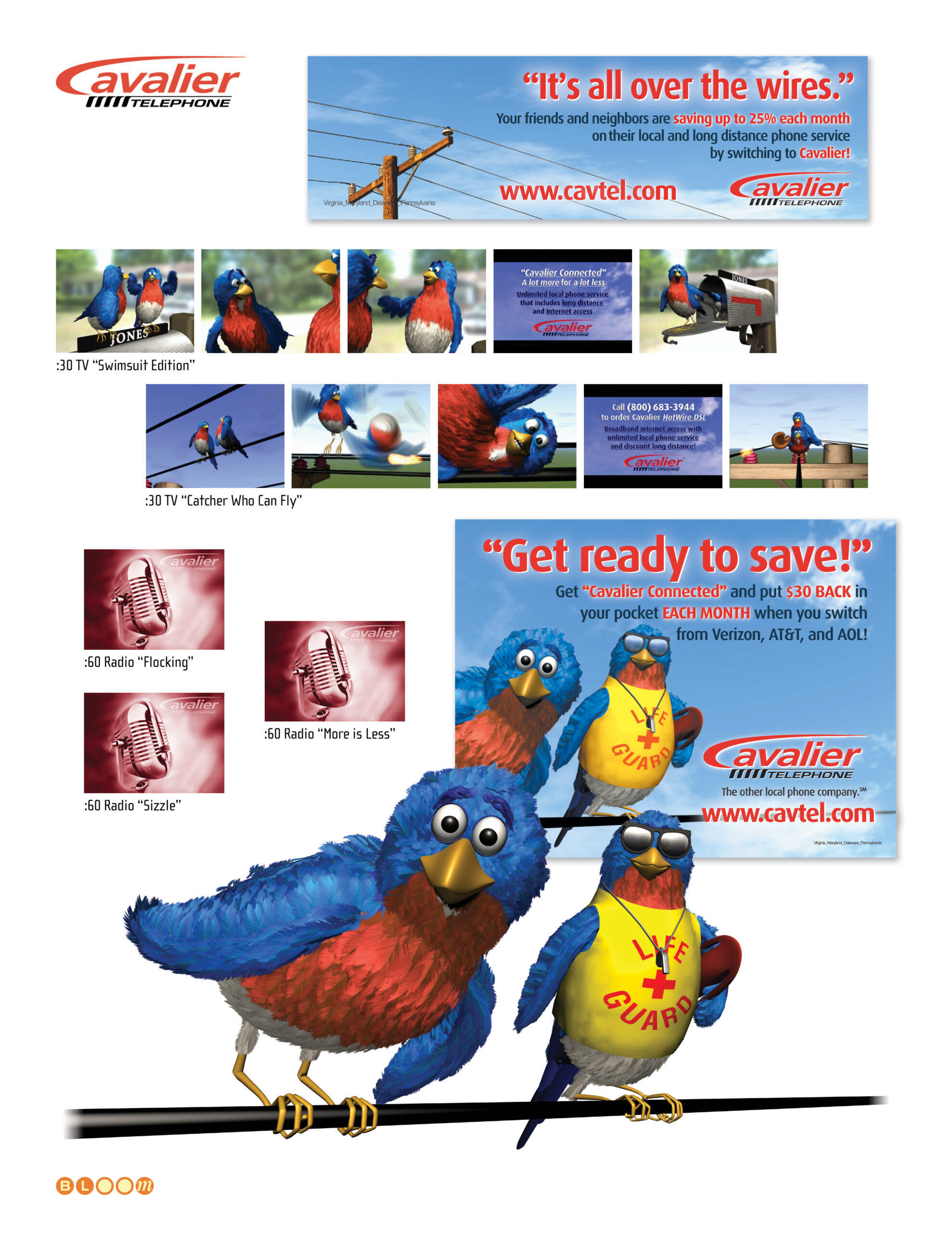
Cavalier Telephone entered the Mid-Atlantic telecommunications market as a competitive carrier in the post-AT&T deregulation landscape, serving neighborhoods underserved by the incumbent Bell companies. The identity needed to project infrastructure credibility and competitive energy simultaneously — the bold italic wordmark with its sweeping red speed stroke achieves both, suggesting momentum without sacrificing the solidity a telephone carrier requires. The engagement extended into award-winning broadcast animation and direct mail campaigns that earned ADDY Gold and Summit Creative Silver recognition.
The Third Way Foundation emerged from the centrist political tradition of the Democratic Leadership Council and Progressive Policy Institute — the intellectual infrastructure of the Clinton presidency era. The identity brief called for something that could operate credibly in Washington’s political environment without the visual language of either party: the clean, spaced serif wordmark with its understated rule achieves exactly that equilibrium, projecting authority without ideology.
Creative Direction, Art Direction, Identity Design, Custom Type, Glyph Modification, Graphic Standards, Environmental Signage, Illustration