The name was, by the founders’ own admission, a joke — YAFO: Yet Another Fiber Optic networking solutions company. It was the kind of self-aware humor that signals a technically confident team comfortable enough with the crowded optical networking landscape of the early 2000s to acknowledge it directly, because they knew they had something nobody else had cracked.
What they had was a solution to polarization mode dispersion — PMD — the signal degradation phenomenon that was blocking telecommunications carriers from upgrading their existing fiber infrastructure to 40 Gbps speeds. The alternative to solving PMD was replacing the fiber. YAFO’s hardware and software compensation technology meant carriers could maximize the utility of their current assets instead. Founded in June 1999 by Henry Yaffe in Hanover, Maryland, the company raised $61 million in venture capital across three rounds before its acquisition by Ciena Corporation — a validation of both the technology and the market timing.
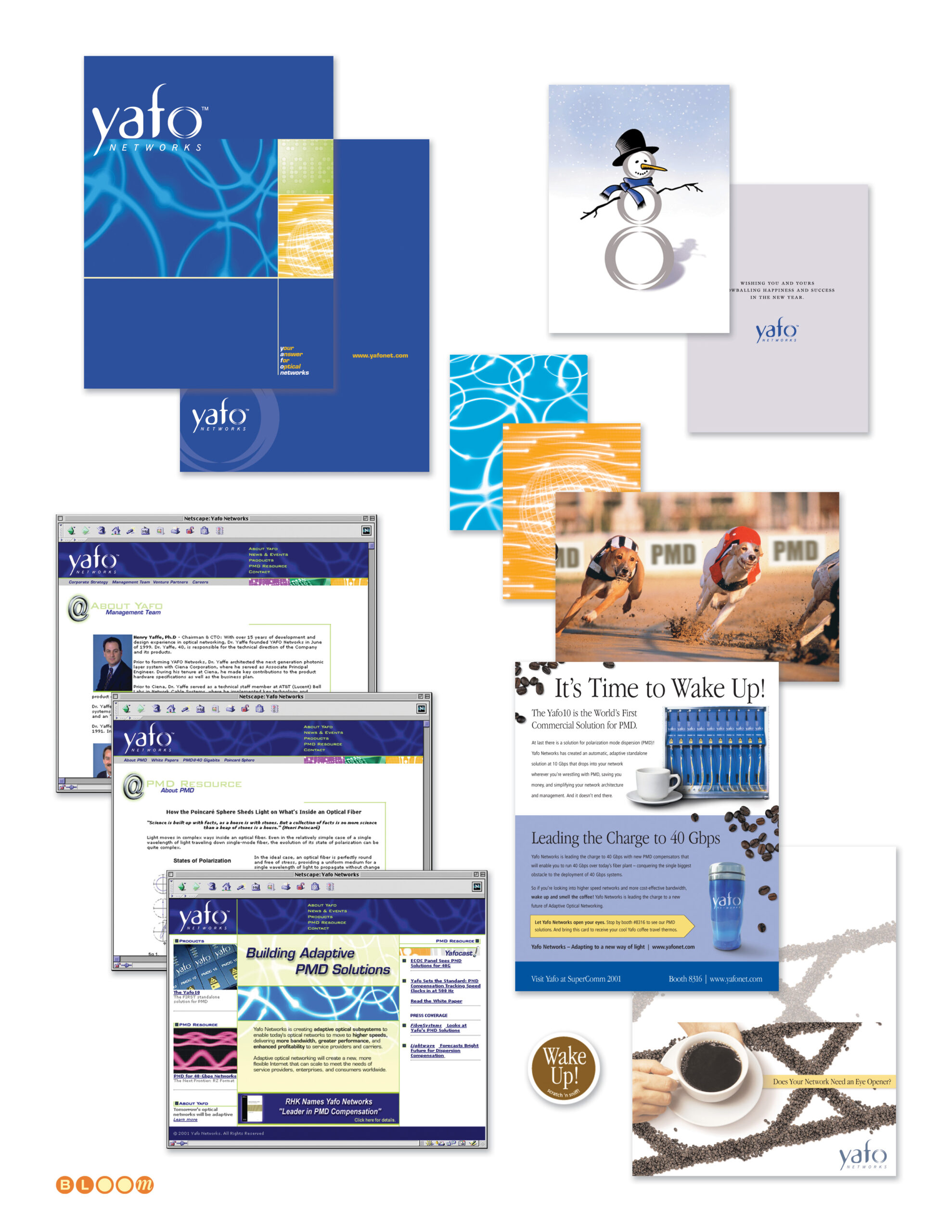
The Bloom Agency was engaged for the full creative scope of YAFO’s marketing communications: identity design, website design, print advertising, trade show campaign, direct mail, and corporate collateral — all of it built in the compressed, capital-intensive atmosphere of the early 2000s optical networking market.
The Yafo logo is my design — a lowercase wordmark in a deep cobalt and aqua palette, with an orbital ring element arcing over the o. The ring is a deliberate double reference: to the optical lenses at the heart of the technology, and to the high-speed networking rings the product was designed to liberate. Light moving through glass at extraordinary speed, made visible in a single typographic gesture.
The website was designed in frames-based architecture for Netscape — the production reality of early 2000s web development — with a full site structure covering corporate strategy, management team, product information, a PMD Resource educational center, press coverage, and investor relations. Getting technical depth and marketing clarity to coexist in that environment required both design discipline and genuine understanding of what the product actually did and why it mattered.
The trade show campaign for SuperComm 2001 — Booth 8316 — was anchored by the “It’s Time to Wake Up!” concept, built around the insight that the industry was sleeping on the PMD problem at 40 Gbps while YAFO had already solved it. The campaign extended across print advertising, trade show materials, and a direct mail invitation that arrived sealed with a coffee-flavored scratch and sniff sticker. The concept and the execution were in complete alignment: every recipient who scratched that seal understood the campaign before they read a word. The greyhound billboard composite — an early Photoshop background replacement technique used as a campaign visualization — rounded out the competitive speed messaging.
The seasonal greeting card completed the relationship collateral — a snowman assembled from the Yafo orbital ring elements, wishing clients and partners happiness and success in the New Year with the same quiet wit that named the company in the first place.
Brand Identity, Logo Design, Orbital Ring Illustration, Website Design, Frames Architecture, Print Advertising, Trade Show Campaign, Direct Mail, Scratch and Sniff Production, Corporate Collateral, Seasonal Greeting Card, Production Management