
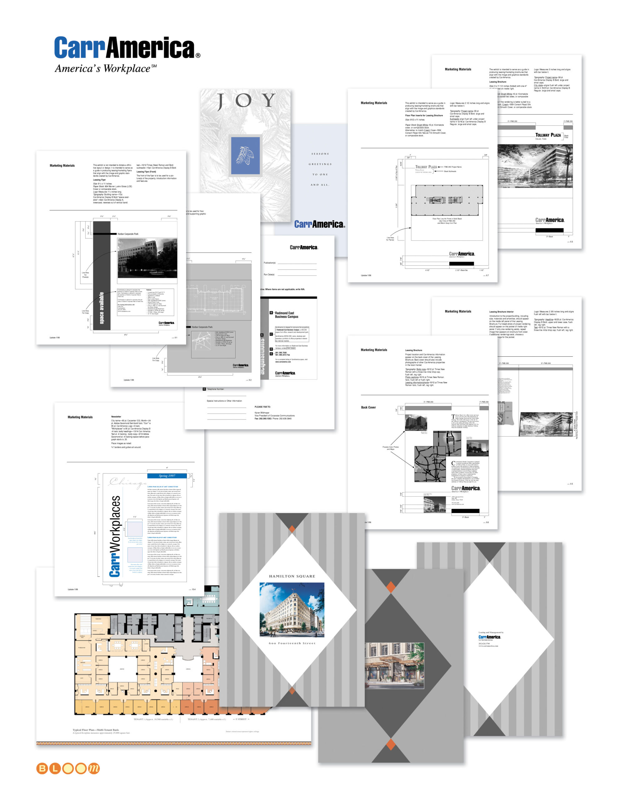
CarrAmerica was one of the largest publicly traded office real estate investment trusts in the United States in the mid-1990s, operating commercial properties across major markets including Washington DC, Dallas, and the Pacific Northwest under the tagline “America’s Workplace.” Managing a national property portfolio at that scale requires more than a recognizable logo — it requires a brand system rigorous enough to govern every leasing brochure, every property advertisement, every floor plan package, and every piece of tenant communication across dozens of properties in multiple markets, produced consistently by different teams in different cities.
The Bloom Agency was engaged to formalize, document, and extend CarrAmerica’s existing brand identity into a reproducible graphic standards system — taking a light existing framework and building it into a comprehensive set of rules governing typography, layout dimensions, color application, marketing materials production, and collateral specifications across every format the organization used. The standards manual became the definitive reference for CarrAmerica’s marketing communications: every measurement specified, every typeface documented, every layout grid defined, so that the brand could be reproduced consistently whether the property was in Dallas, Redmond, or downtown Washington DC.
That system was then applied across a sustained engagement producing the full spectrum of CarrAmerica’s marketing collateral. Individual property leasing packages — each one a self-contained marketing document for a specific building or campus — were designed and produced for properties including Tollway Plaza in Dallas, Redmond East Business Campus in the Pacific Northwest, Hamilton Square on 14th Street in Washington DC, and Fairfax Corporate Park in Northern Virginia. Each package carried its own visual character appropriate to its market and property type while remaining unmistakably within the CarrAmerica brand framework.
The floor plan production work was particularly exacting — architectural floor plans rendered and formatted for leasing materials, with multi-tenant layout variations showing different configuration options for prospective tenants. Getting floor plans to read clearly and persuasively as marketing documents, rather than merely as technical drawings, requires a specific kind of visual intelligence that sits at the intersection of information design and brand communication.
The engagement also produced the CarrWorkplaces newsletter system, a seasonal corporate greeting card program, print advertising for available space across the portfolio, and a standardized leasing inquiry response and fulfillment package system — the complete communications infrastructure of a national commercial real estate operation.
Brand Standards Formalization, Documentation and Extension, Graphic Standards Manual, Property Leasing Brochures, Floor Plan Production, Print Advertising, Newsletter Design, Corporate Communications, Collateral Design, Print Production Management